Author: admin-esccom

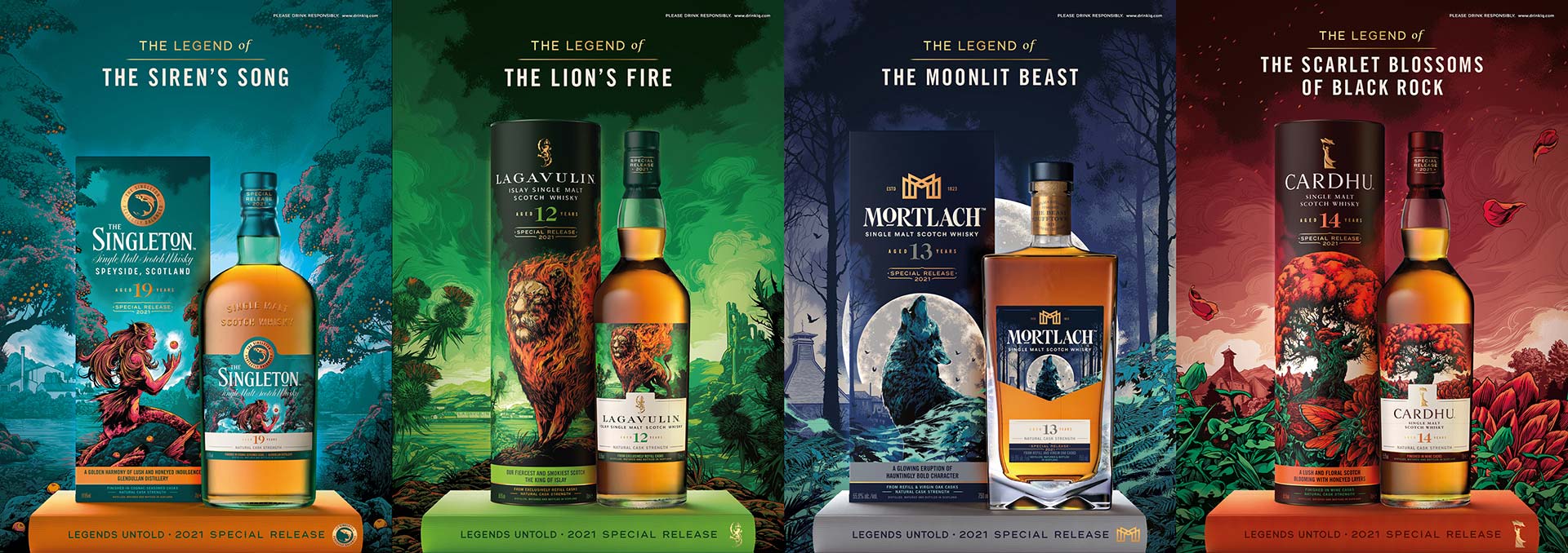
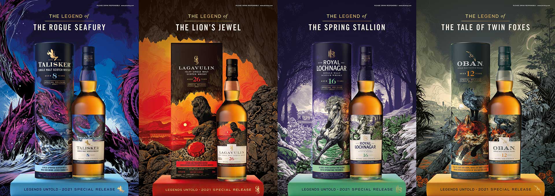
“Legends Untold”, the new mythological collection from Special Releases

Legends Untold
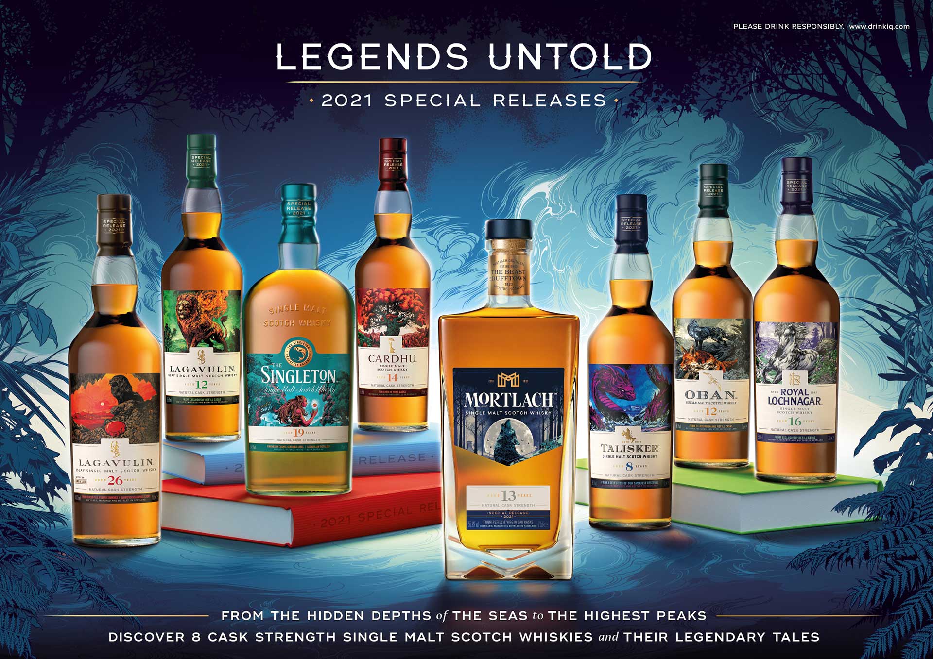
Since 2001, one of the highlights of the year for whisky aficionados has been the launch of Diageo’s Special Releases. This collection of limited edition single malts changes every year and includes some of the company’s most famous and legendary distilleries. This year, the 8 whiskies selected by master blender Craig Wilson are grouped around the “Legends untold” concept, forming one of the most beautiful collections to date.

The labels have been illustrated by Ken Taylor and depict eight legends about mythological creatures that symbolise the characteristics of each distillery or the area where they are located. Each box includes a QR that unlocks an augmented reality video explaining the history and tasting notes of the whisky through the wonderful voices of actors Lorne MacFadyen and Siobhan Redmon.

The collection portrays the otherworldly beings that have fiercely guarded the heart of remote Scottish distilleries for an eternity, according to their ancient fables. Drawn from renowned distilleries, the collection nods to the hidden gems that can be found in every corner of the Scottish terrain between the lochs and the rugged highlands.

The hand-picked annual selection highlights the diversity of Scotland’s most prized whisky stocks maturing in Scotland. Each whisky is brought to life visually with highly detailed illustrations and design work by renowned digital illustrator Ken Taylor. His striking signature style and interpretation of mythical creatures draws inspiration from his portfolio of pop culture artwork.

Activated via an on-pack QR code, a multi-sensory experience begins with a narration of the history of cask strength Single Malts. Enthusiasts are then guided through a mixed reality tasting experience, designed to captivate their senses and bring the taste of Scotland into their homes.

  • Legends Untol
  • Legends Untol


(Source: Diageo)

Can you learn typography on Instagram?

Learning the discipline of typography is a constant process that begins in academies, universities, books or through agency work.

However, there is nowadays a field that, although it will never replace traditional media, can act as a lure to attract the curiosity of those who are approaching the world of typography for the first time. We are talking about social networks and the role they can play as typographic disseminators.

More and more designers, digital foundries and typographic software are devoting a large part of their content to trying to teach the basic rudiments of typography. Perhaps this has to do with the didactic gene that countless graphic communication professionals possess.

aprendizaje tipografia academia

In any case, let’s take a look at some significant examples of typographic dissemination on Instagram. Some, more for the love of art; others, more as a promotional strategy.

ohno type

This Californian digital foundry often shares typographic tips and tricks on her extensive Instagram account (@ohnotypeco) with more than seventy thousand followers. They have an account in Spanish (@ohnoenespanol) dedicated exclusively to teaching the basics of type design. And with a great sense of humour.

aprendizaje tipografia academia

To complete the pedagogical work, this time outside the networks, on its website, Ohno Type has just released the section Ohno Type School where the e-book can be purchased Some tips on drawing types from A to Z. A dissemination effort shared by an increasing number of foundries and designers.

type design class

Another example can be found in Type Design Class, the Instagram account of the informative project through which the typographic designer and illustrator Viktor Baltus teaches the basics of typographic design to a community of more than sixty thousand followers. On the website we find all kinds of resources and courses aimed primarily at professional designers.

aprendizaje tipografia academia

grilli type

The Swiss from Grilli Type They have a very large Instagram account with 210,000 followers and under the hashtag #GTAcademy publish typography lessons (now number 37) in which they deal with specific aspects of type design, such as the design of letters with diagonals or special characters.

tipografía en Instagram

glyphs

To end this brief review of Instagram accounts that dedicate all or part of their content to the dissemination of typographic design knowledge, we will end with the account of Glyphs, the reference software for type design.

An account where we can find a lot of content about how the programme works. This logically entails delving deeper into the guts of digital typographic design, through tutorials with tips and tricks.

tipografía en Instagram

An Instagram post cannot match the depth and reflection of a book or method. The closeness we find in a classroom, but it can arouse the curiosity of someone who otherwise would never have come close to typography.

(Source: Gráffica)

Coca-Cola’s controversial new packaging bet

When a brand as big as Coca-Cola makes a graphic change, it is always big news in the world of visual culture. In this case, the company has presented new packaging for Coca-Cola Café Mocha and another for the Coca-Cola Flavours line.

As Brandan Strickland, Coca-Cola’s brand director, explains, the proposal to create Coca-Cola in a coffee version stems from the need to increase the moments to consume a Coca-Cola: “We believe that Coca-Cola with coffee is the perfect option for those who want the stimulating and refreshing taste of a Coca-Cola with the familiar flavour of coffee”.

polémica apuesta Latas-Coca-Cola-2

New proposals

In January 2021, the first Coca-Cola coffee proposals went on sale with the flavours Dark Blend, Vanilla, Caramel and Vanilla Zero Sugar. Now, they have launched the Café Mocha version, a new proposal that will seek to succeed in this new sector. For all these new flavours they have designed a new packaging that stands out for being a longer can than usual with the label of each flavour and a simple reference to the coffee.

But the most relevant proposal in terms of packaging comes from Coca-Cola Flavours. This is the line that includes the new flavours launched by Coca-Cola and they have created new packaging to make it easier for consumers to differentiate them visually.

polémica apuesta Latas-Coca-Cola-4

The launch is highlighted by new vibrantly coloured cans for Cherry, Vanilla and Cherry Vanilla flavours and their sugar-free equivalents. They feature a bold logo positioned to clearly distinguish between sugar (white font) and zero sugar (black font). The single-coloured cans will be for single flavours and the two-coloured cans will be for flavour fusions.

The brand unveiled the first phase of this packaging change in 2021 for Coca-Cola Original Taste and Coca-Cola Zero Sugar. “We wanted to modernise and simplify the look of our packaging to help consumers find the taste they are looking for on the shelf through a colourful yet clean design,” says Natalia Suarez, senior manager, Coca-Cola North America.

The new Coca-Cola Flavours packaging has not taken long to be criticised on social networks. The differentiation of the colours in the logo to indicate whether the Coca-Cola is Zero does not seem to be a very successful way of communicating. Many users have claimed that this measure poses problems of legibility.

For example, in the case of Cherry Coke, there is a black logo on a dark purple background. In the case of Vanilla Coke it is white on gold. It seems obvious that this mixture of colours gives problems of readability.

Latas-Coca-Cola-4

In recent months, Coca-Cola has launched different proposals for its visual identity that have been very popular. One of them was the modification of the logo for a recent campaign and another was the launch of a new minimalist packaging in April. We will see what the company surprises us with in the future.

logo kit color neg

Benefit and boost your business

logo maet
  • Intersport
  • Ayuntamiento de Sevilla
  • Hyundai
  • Comunidad de Madrid
  • LaLiga
  • Warner Music Spain
  • Protisa
  • Liga Endesa
  • Navantia
  • Paramount
  • Museo del Prado
  • TVE
  • Repsol
  • Havas Media
  • Universidad Europea
  • EMI
  • Alisios
  • Danone
  • Uned

© Escuadra Comunicación

Utilizamos cookies para optimizar nuestro sitio web.    Ver preferencias
Privacy